WHEN DESIGNING A RAFFLE WEBSITE
🎟️ THE THINGS PEOPLE DON’T THINK ABOUT WHEN DESIGNING A RAFFLE WEBSITE… 👀
When you run an online competition business, it’s very easy to become obsessed with the obvious things.
What prize are we giving away? 🏆
How much should a ticket cost? 💷
How many tickets should we sell? 🎟️
What should the Facebook advert look like? 📱
How are we going to get people through the door?
All important questions.
But there’s one part of the business that often gets overlooked…
WHAT ACTUALLY HAPPENS WHEN SOMEONE CLICKS YOUR WEBSITE?
Because getting somebody to your website is only half the battle.
Imagine this…
Someone sees your competition while scrolling Facebook.
They see a car. 🚗
A holiday. ✈️
A huge cash prize. 💷
Whatever it might be.
They’re interested.
They click.
Now you’ve got their attention.
But what happens next?
Can they immediately see what the competition is?
Can they understand the prize without having to read a novel? 😂
Can they see how much a ticket costs?
Can they instantly see how many tickets are available?
Can they find the entry button?
Can they select their numbers without getting confused?
Can they get through checkout quickly?
And once they’ve paid…
Do they immediately know their entry has been successful?
These things might sound incredibly basic, but they’re all part of the customer journey.
And the customer journey can make a massive difference to how someone feels about a competition website.
📱 THEN THERE’S MOBILE DESIGN…
This is probably one of the biggest things people underestimate.
Your website might look absolutely fantastic on a big desktop monitor.
Perfect spacing.
Beautiful images.
Everything lined up perfectly.
Then someone opens it on their phone and suddenly…
The buttons are tiny. 😬
The text is all over the place.
Images take forever to load.
You have to zoom in.
The checkout feels awkward.
And remember…
Your customer isn’t necessarily sitting at a desk with a cup of coffee specifically looking for your competition.
They could be scrolling Facebook at 10:47pm.
They could be waiting for a train.
They could be sitting in the pub.
They could be lying in bed.
They see something they like and think:
“Go on then… I’ll have a go.” 😂
That’s the moment your website needs to make entering ridiculously straightforward.
🎨 THEN THERE’S THE DESIGN ITSELF.
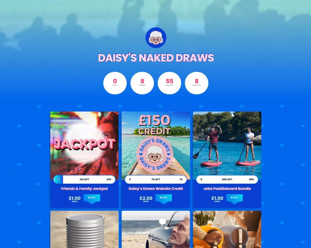
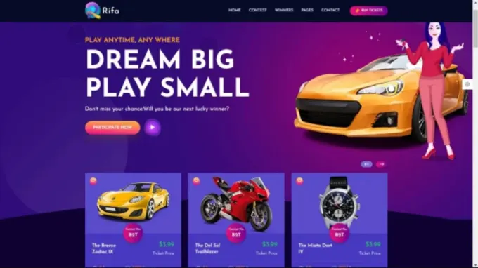
A raffle website doesn’t necessarily need to be covered in flashing animations, massive banners and every possible feature known to mankind.
Sometimes less is more.
Clear prize photography.
Easy-to-understand information.
Obvious entry buttons.
Simple navigation.
A checkout that doesn’t feel like you’re applying for a mortgage. 😂
The website should ultimately get out of the way and let the competition and the prize do the talking.
🔐 AND THEN THERE’S TRUST.
This is another massive one.
If someone has never entered one of your competitions before, they’re naturally going to have questions.
Who are you?
How does it work?
What happens after I enter?
Where can I see the terms?
How are winners selected?
How are winners contacted?
Where can I see previous winners?
A professional website should make those answers easy to find.
Because people aren’t just buying a ticket…
They’re deciding whether they trust your business enough to enter.
⚡ SPEED MATTERS TOO.
Nobody likes waiting.
Especially online.
If someone clicks a competition and the website sits there loading…
…and loading…
…and loading…
There’s a good chance they’ll be back on Facebook before the page has even finished opening. 😂
A good competition website needs to feel quick, responsive and straightforward.
🎟️ AND HERE’S THE FUNNY THING…
Most customers will never sit there thinking:
“Wow, what fantastic UX design.”
They won’t care what plugin you’re using.
They won’t care what framework the website was built on.
They won’t care how many hours went into designing the checkout.
And they certainly won’t know how much work went on behind the scenes.
They’ll simply think:
“That was easy.”
And honestly?
That’s the goal.
The best website experience can sometimes be the one people barely notice because everything just works.
💭 SO IF YOU RUN A COMPETITION BUSINESS…
Have a look at your own website today.
Don’t look at it as the owner.
Look at it as someone who’s never visited before.
Open it on your phone.
Pretend you’ve just discovered your business through Facebook.
Ask yourself:
👉 Can I understand what you offer within 5 seconds?
👉 Can I find a competition quickly?
👉 Is the prize information clear?
👉 Is the entry process obvious?
👉 Does the checkout feel easy?
👉 Can I find your terms and conditions?
👉 Can I see previous winners?
👉 Does the website make me feel confident entering?
And perhaps most importantly…
Would YOU enter a competition on your own website if you’d never heard of the company before?
That’s a pretty good test. 👀
🎟️ A raffle website isn’t just a place where competitions are displayed.
It’s the point where someone decides:
“I’m going to enter.”
And sometimes it’s the smallest details that make that decision happen.
👇 Competition owners what’s one thing you’ve changed on your website that made the biggest difference to your customers?
I’d be genuinely interested to hear what you’ve found works. 🎟️💻
Share this